Wednesday, February 22, 2012

It’s a window, not a flag

Windows 8 logo
Windows 8 logo designed by Pentagram


That’s how Sam Moreau, principal director of user experience for Windows, felt when Paula Scher of Pentagram showed him her sketches for the new Windows logo.
“Paula asked us a simple question, ‘Your name is Windows. Why are you a flag?’”

Tuesday, February 21, 2012

Volvo logo background


Volvo logo


Much of the following info is from The Volvo Owners Club.

When the decision was taken to start producing Volvo cars in August 1926, financial backer Svenska Kullagerfabriken – SKF – reactivated a company that had been idle since 1920 for the purpose. The name of that company was Volvo — formed in 1915 for the manufacture and marketing of bearings for the automotive industry.

Monday, February 20, 2012

Building a Small Business Brand : Why Your Logo Matters ?

A logo helps in identifying a business or organization in its simplest form through use of a mark or icon. Logo should not be confused as a brand. Branding is the whole corporate image of an organization or business. Logo design and branding have different roles to build a perceived image of an organization, product or business. Let us have a quick look at the concept of branding.


Sunday, February 19, 2012

How To Redesign A Logo ?

No matter how small a logo might seem, it plays a great part in making a brand; the influence a logo has online is huge. Redesigning a logo is even more complicated than creating it. Even if a good logo is a logo that never gets outdated, sometimes a change in it can be a good thing, an improvement. Redesigning a logo is a part of a company’s attempt to revitalize its activity from time to time.

Wednesday, February 15, 2012

Combined logos

Via Ray Vellest.
Reminiscent of johnson banks’ logo mash-ups.

On the 2012 US election campaign logos


Rick Santorum logo


Steven Heller, Debbie Millman, and Alice Twemlow gave their thoughts on the 2012 US election campaign logos. Here’s a snippet from the post on SVA’s Visual Arts Briefs.


Tuesday, February 14, 2012

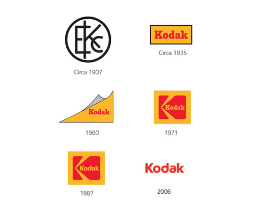
Kodak logo evolution


Sad news today that 131-year-old Kodak has filed for bankruptcy.
As good a time as any to take a quick look at the Kodak logo evolution.

Early 1900′s
Kodak is the first company to integrate its name and look into a symbol.
1930′s
Focus moved to the Kodak name and the red and yellow “trade dress” color.
1960′s
The corner curl was introduced.
1970′s
The mark retained the red and yellow colors and the Kodak name, but a box and graphic “K” element were added.
1980′s
A more contemporary type font streamlined the Kodak name within the existing logo.
Today
The box is gone, simplifying the logo. The rounded type font and distinctive “a” give the name a more contemporary look.