Sunday, March 4, 2012
IDA and Pentagram recreate Pangaea
The International Design Alliance (IDA) has unveiled a new visual identity for its biennial IDA Congress, “the primary event for dialogue between designers and stakeholders of design in a summit format.”


Wednesday, February 22, 2012
It’s a window, not a flag
Tuesday, February 21, 2012
Volvo logo background

Much of the following info is from The Volvo Owners Club.
When the decision was taken to start producing Volvo cars in August 1926, financial backer Svenska Kullagerfabriken – SKF – reactivated a company that had been idle since 1920 for the purpose. The name of that company was Volvo — formed in 1915 for the manufacture and marketing of bearings for the automotive industry.
Monday, February 20, 2012
Building a Small Business Brand : Why Your Logo Matters ?
A logo helps in identifying a business or organization in its simplest
form through use of a mark or icon. Logo should not be confused as a
brand. Branding is the whole corporate image of an organization or
business. Logo design
and branding have different roles to build a perceived image of an
organization, product or business. Let us have a quick look at the
concept of branding.
Sunday, February 19, 2012
How To Redesign A Logo ?
No matter how small a logo might seem, it plays a great part in making a
brand; the influence a logo has online is huge. Redesigning a logo is
even more complicated than creating it. Even if a good logo is a logo
that never gets outdated, sometimes a change in it can be a good thing,
an improvement. Redesigning a logo is a part of a company’s attempt to
revitalize its activity from time to time.
Wednesday, February 15, 2012
On the 2012 US election campaign logos
Tuesday, February 14, 2012
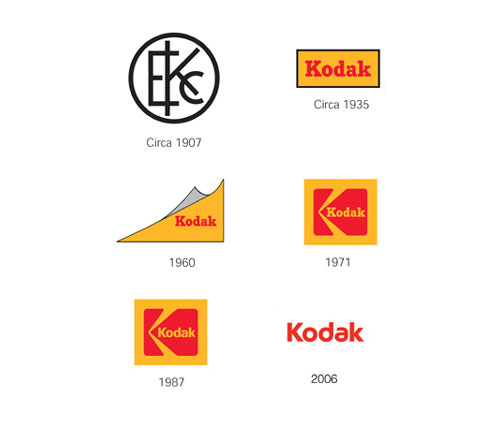
Kodak logo evolution
Sad news today that 131-year-old Kodak has filed for bankruptcy.
As good a time as any to take a quick look at the Kodak logo evolution.
Early 1900′s
Kodak is the first company to integrate its name and look into a symbol.
1930′s
Focus moved to the Kodak name and the red and yellow “trade dress” color.
1960′s
The corner curl was introduced.
1970′s
The mark retained the red and yellow colors and the Kodak name, but a box and graphic “K” element were added.
1980′s
A more contemporary type font streamlined the Kodak name within the existing logo.
Today
The box is gone, simplifying the logo. The rounded type font and distinctive “a” give the name a more contemporary look.
Why A Great Logo Design Is All In The Metaphor ?
Whether you are after a logo for your business, website or perhaps
just a personal blog, coming up with a great design is not as simple as
most would think. The process of moving from concept to finished design
is time consuming and requires the consideration of many different
elements before the final result is ready to be unveiled.
A good logo design will rely on you being able to produce a logo that says everything you want it to about your business or website or blog. Whether it is for business or personal use, it should convey to those who see it what you do as well as a sense of trust and credibility. Trying to incorporate all of these things into one single image may sound complex, but it is really about creating a logo design that will get people’s attention and tell them what they want to know in an instant.
A good logo design will rely on you being able to produce a logo that says everything you want it to about your business or website or blog. Whether it is for business or personal use, it should convey to those who see it what you do as well as a sense of trust and credibility. Trying to incorporate all of these things into one single image may sound complex, but it is really about creating a logo design that will get people’s attention and tell them what they want to know in an instant.
Sunday, February 12, 2012
What Makes An Effective Logo ?
Logos are the single most important entity that make your company
recognizable to people. This small design is used to identify a brand
and set it apart from competitors.
The main purpose of a logo is to leave a mark in the viewers mind and make it unforgettable. Logos must evoke a sense of trust and respect in the viewer. It is important to remember that a logo is merely a signature or a sign to help consumers identify a particular name. Logos do not sell products, they only create an identity
The main purpose of a logo is to leave a mark in the viewers mind and make it unforgettable. Logos must evoke a sense of trust and respect in the viewer. It is important to remember that a logo is merely a signature or a sign to help consumers identify a particular name. Logos do not sell products, they only create an identity
CAUTION : 5 Harmful Things a Logo Should NEVER HAVE
The correct blend of elements is vital in crafting an effective logo design.
Nowadays, the prime objective of a logo design is to stand out and
magnetize its intended target audience. With the increasing number of
logo design companies being formulated and the resultant amount of logo
designs being made, it’s hard to make your company logo memorable for
your clients.
New theory for logo design these days is…simple attracts, complex detracts. This is because too many elements spoil the logo design. We have numerous examples in front of us that validate this point. One must realize that a logo does not necessarily state each and every aspect of the business.
Most of us are aware of what elements make a successful logo design but seldom are cognizant of the things that should never be added in your logo. Today I would like to enlighten you with 5 things that surely must NOT be included in a logo design.
Subscribe to:
Posts (Atom)


